LinkedIn Banner Size Is 1584 x 396 and Your Profile Photo Covers Part of It
What Size Should a LinkedIn Banner Be?
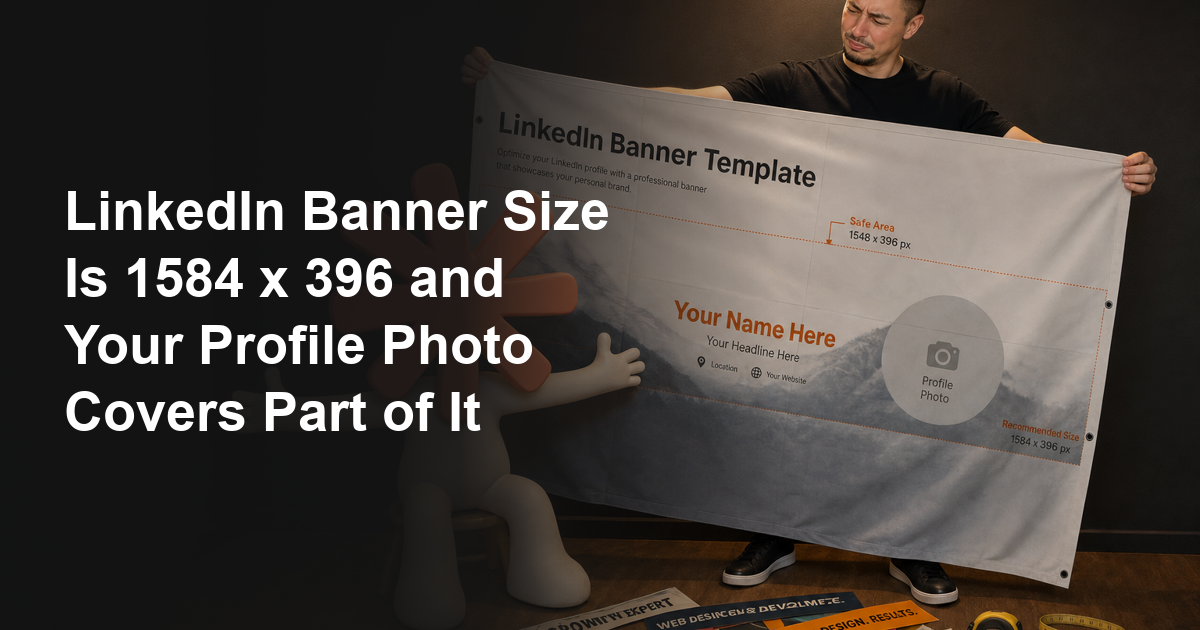
The LinkedIn banner size for a personal profile is 1584 pixels wide by 396 pixels tall. Save it as a JPG or PNG under 8MB.
That comes from LinkedIn’s own help page on changing your background photo, not from a design blog. It works out to a 4:1 ratio.
If you only came for the number, that’s the number. You can stop reading.
But I’ve redone a lot of client banners that were built at exactly 1584 by 396. They still looked broken once they went live.
The size was right. The design was wrong.
Nobody had told them that LinkedIn puts a circle over the bottom left corner of the image. Or that a phone shrinks the whole thing to about a quarter of its width.
Here’s what LinkedIn itself publishes for the two images on your personal profile.
| Image | Size | Format | File limit |
|---|---|---|---|
| Profile background (the banner) | 1584 x 396 px recommended | JPG or PNG | Under 8MB |
| Profile photo | 400 x 400 px minimum, up to 7680 x 4320 px | PNG or JPG | Under 8MB |
Both of those come straight from LinkedIn’s help documentation.
I’ve linked the sources so you can check them yourself. That’s worth doing, because a lot of the numbers in other guides don’t match what LinkedIn says.
More on that further down. One of the most widely repeated LinkedIn image sizes online is off by nearly four times.
Where Does Your Profile Photo Cover the Banner?
Your profile photo sits over the lower left of the banner on desktop. It covers roughly the bottom half of that corner, and anything you put there is gone.
This is the part I had to work out by testing rather than by reading.
Every client banner I’ve had to fix ran into the same thing. It was never the pixel count that caused it.
People design a banner in Canva, centre their logo and their tagline in the left third, and upload it. Then they discover their own face is sitting on top of the word they most wanted read.
I’ve watched clients do this three times in a row before working out what was happening.
It’s not obvious from the upload screen. LinkedIn’s own cropping preview doesn’t show the profile photo on top of the banner while you’re positioning it.
The rule I use on every client profile is simple. Treat the lower left as unusable, and put nothing there that a stranger needs to read.
That means your name, your tagline, your logo and your website all belong somewhere else in the frame.
The right two thirds are safe. The top strip across the full width is safe. The lower left is not.
If you’d rather see it than take my word for it, I built a free LinkedIn banner maker. It draws the profile photo circle onto the preview while you type.
You can switch between the desktop and phone views, and it prints the size each line lands at once a phone shrinks it.
That overlay is the entire reason I built it. It’s the one thing you can’t check anywhere else before you upload.
Is the 1350 x 220 Safe Zone Real?
You’ll see a “safe zone” of 1350 by 220 pixels quoted on several guides that currently sit on page one. I’d treat that number carefully, for two reasons.
The first is that I can’t find it anywhere in LinkedIn’s documentation.
It appears on multiple third-party pages, worded almost identically each time. That repetition usually means one page published it and the rest copied it.
The second reason matters more.
A safe zone of 1350 by 220 describes a rectangle centred in the frame. The margins are even on all four sides. But the thing obstructing your banner isn’t centred.
Your profile photo sits in one corner, so the damage is lopsided.
A centred safe zone tells you to pull your margins in evenly. It doesn’t tell you that the bottom left specifically is a write-off while the top left is completely fine.
Follow the rectangle and you can still land your logo underneath your own face.
So I don’t use it. I use two rules that describe the actual obstructions:
- Keep anything that must be read out of the lower left corner, where the profile photo lands on desktop.
- Set the type far larger than looks right in your editor, because a phone renders the banner at roughly a quarter size.
Between them, those two rules leave a generous working area. It runs across the top and down the right side of the frame.
That’s where I put every headline I design.
What Changes on a Phone?
Your banner gets smaller, and that is the whole of it. The 4:1 frame is kept, so what you lose on a phone is legibility rather than the edges.
I want to be careful here, because this is where the guides contradict each other and me.
Among the pages ranking right now, one says mobile crops the sides and keeps the centre. Another says mobile crops the top and bottom. A third puts a number on it, at fifteen percent off each side.
I went looking for LinkedIn’s own statement while writing this. LinkedIn publishes the recommended upload size and the file limits, and I can’t find a published crop geometry anywhere in that documentation.
So I checked a real profile on a real phone instead, which is the part I’d trust over any of it. The banner is simply scaled down. Nothing is sliced off the sides.
That matters because the two models point you in opposite directions. A crop tells you to pull everything toward the centre. A shrink tells you to make your type bigger.
Here is the arithmetic that follows from the shrink. Your banner is 1584 pixels wide, and a phone gives it roughly 375, so everything on it renders at about a quarter of the size you drew it.
A 20-pixel line of type in your design lands at about 5 pixels on a phone. That is a grey smudge.
This is the single most common thing wrong with the banners I get sent. The layout is fine and the size is right, and the sub-line is unreadable on the device most people will see it on.
So the rule is uncomfortable but simple. If a line matters, it needs to be far bigger than looks sensible in your image editor, and if it doesn’t matter, cut it.
The banner maker does this arithmetic for you. It shows the banner at true phone scale and prints the rendered size of each line, so you can see which ones survive before you upload anything.
Want this done for you? Book a free strategy call →
What Are All the Other LinkedIn Image Sizes?
Every LinkedIn image size below comes from LinkedIn’s own help pages. You can check each one against the source rather than against another blog post.
| Image | LinkedIn’s stated size | Format | File limit |
|---|---|---|---|
| Profile background photo | 1584 x 396 px | JPG or PNG | Under 8MB |
| Profile photo | 400 x 400 px min, 7680 x 4320 px max | PNG or JPG | Under 8MB |
| Page logo | 268 x 268 px min, 400 x 400 px recommended | PNG or JPEG | Under 3MB |
| Page cover image | 4200 x 700 px | PNG or JPEG | Under 3MB |
| Life tab main image | 1128 x 376 px | PNG or JPEG | Under 3MB |
| Life tab custom modules | 502 x 282 px | PNG or JPEG | Under 3MB |
| Life tab company photos | 264 x 176 px min, 900 x 600 px recommended | PNG or JPEG | Under 3MB |
| Page post with a link | 1200 x 627 px, 1.91:1 | PNG or JPEG | Under 3MB |
Two things in that table deserve pointing out, because they get flattened in a generic size list.
The file limits aren’t the same across the board. Your personal profile images can go up to 8MB, while every image on a company Page is capped at 3MB.
Guides that print a single “8MB” cell for all LinkedIn images are merging two different specifications. The one that bites you is the smaller one.
The company Page cover number is the bigger problem, and it gets its own section.
Why Do the Guides Disagree About the Company Page Cover Size?
LinkedIn’s image specifications page states that the Page cover image is 4200 by 700 pixels.
Most of the guides currently on page one for LinkedIn image sizes say 1128 by 191 pixels.
That’s nearly four times the width.
I don’t think anyone is being dishonest about it.
My read is that 1128 by 191 was accurate at some point. It got copied from guide to guide, and then it stopped matching LinkedIn’s published spec while the copying carried on.
Once a number is on 20 pages, the 21st page copies it too, and nobody goes back to the source.
The practical consequence is straightforward. If you build a Page cover at 1128 by 191, LinkedIn still renders a 4200 by 700 frame. Your image gets stretched to nearly four times its width.
That’s exactly how you end up with the soft, smeared Page headers you see all over the platform.
Build it at 4200 by 700 and keep it under 3MB.
If that produces a file over the limit, export as JPEG at a moderate quality setting. Don’t drop the pixel dimensions to hit the cap. The dimensions are what protect the sharpness.
The wider lesson applies to every size list you read, including this one.
Check the number against LinkedIn’s own help pages before you build anything. I’ve linked all three pages I used, and verifying the lot took me under 10 minutes.
Why Does My LinkedIn Banner Look Blurry?
A blurry LinkedIn banner is almost always a file that was smaller than 1584 by 396. It got stretched to fit.
Upscaling doesn’t add detail.
When LinkedIn renders a 1200 pixel wide image across a 1584 pixel frame, it invents the missing pixels. It averages the ones it already has. The result is the soft, mushy look you were trying to avoid.
The fixes, in the order I’d try them:
- Export at 1584 by 396 exactly, rather than at something close and letting LinkedIn resize it.
- Start from the highest resolution source you have. Scaling a large image down keeps detail, and scaling a small one up cannot.
- On a high-density screen, export at double, so 3168 by 792, and let the browser downsample. That stays well under the 8MB limit for a normal design.
- Use PNG for flat colour, text and logos. Use JPEG for photographs.
That last point catches people out.
A PNG of a photograph can blow past the file limit. A heavily compressed JPEG of crisp text produces visible fuzz around every letter.
Can You Upload a Different Size?
You can, and LinkedIn will accept it, which is part of the problem. The upload doesn’t fail, so nothing tells you anything went wrong.
What happens next depends on which way you missed:
- Too small, so anything under 1584 by 396. The image gets stretched up and goes soft.
- Too large but the same 4:1 shape, so something like 3168 by 792. This is fine, because it scales down cleanly and often looks better on high-density screens.
- The wrong shape, so something like 1920 by 1080. LinkedIn crops it to fit the 4:1 frame and decides what to keep.
A 16:9 image loses most of its height, which usually means the top and bottom of whatever you designed.
That third case is behind the “does 1920x1080 work on LinkedIn” question that keeps coming up.
It uploads, then gets cut down to a letterbox strip, so in practice it works badly.
Match the 4:1 ratio and you keep control of what stays in frame. Miss it and LinkedIn makes that decision for you.
How Do You Change Your LinkedIn Banner?
On desktop, open your profile and click the camera icon in the top right of your intro section. Choose Edit profile background, upload your file, adjust the position, and save.
On the mobile app, tap the banner area at the top of your profile. Then tap Change and follow the prompts. You can drag to reposition and pinch to zoom.
There’s one step people skip. After you save, look at your own profile on your phone, not the editor preview.
That’s the only place the profile photo overlap and the real phone size show up together. It takes about five seconds.
If something is covered, go back and move it rather than living with it.
I’ve seen good banners sit broken on profiles for years because nobody did the five second check.
What Should the Banner Say?
A banner has about one second to do its job. It’s read at a glance, on a phone, by someone deciding whether you’re worth their attention.
Keep the headline under roughly eight words, and make it something a stranger understands without context.
“Helping ambitious brands unlock their potential” tells a visitor nothing. “I write cold email that books meetings” tells them what you do and whether they need it.
A few things that consistently work on client profiles:
- A plain statement of who you help and what changes for them.
- One piece of specific proof, like a number or a named result, if you have one that is genuinely yours.
- Your website, small, in a corner that is not the lower left.
And a few that consistently don’t:
- A stock photo of a city skyline or a handshake, which says nothing and appears on 10,000 other profiles.
- Your full service list crammed into 396 pixels of height.
- Anything in a font small enough that you have to lean in on a phone.
I’ll be honest about the ceiling here. The banner is the smallest lever on your profile.
It buys attention that your headline and About section then have to convert. A beautiful banner on a vague profile just makes the vagueness look tidier.
If you want the rest of it in order, I wrote up what to fix and in what sequence under LinkedIn profile optimization.
The banner is step one of about seven, and it’s the least important of the seven.
What This Means for Your Profile
If you take three things from this, take these.
The size is 1584 by 396, JPG or PNG, under 8MB. That number comes from LinkedIn, not from a guide.
Your profile photo covers the lower left on desktop, so design around it instead of into it.
And check any LinkedIn image size against LinkedIn’s own help pages before you build. The copied numbers in circulation are out of date on at least one image type.
Once the banner is done, the profile underneath it is what turns a visitor into a conversation. Then the content is what brings visitors in the first place.
If that’s where you’re heading next, I’ve written up the LinkedIn hooks that stop the scroll. I’ve also broken down the post formula I use for client accounts.
There’s also a LinkedIn post generator if you’d rather have something write the first draft. You’ll find it next to the rest of the free tools.
Here’s what this looks like running together. One client profile went from 139,527 to 346,001 monthly impressions in a single month, on fewer posts.
I broke down exactly what changed.
FAQ
What is the LinkedIn banner size?
1584 pixels wide by 396 pixels tall for a personal profile, which is a 4:1 ratio. LinkedIn accepts a JPG or PNG under 8MB. That figure comes from LinkedIn's own help page rather than from a third-party guide.
What is the maximum size for a LinkedIn profile banner?
The file has to stay under 8MB, and the format must be JPG or PNG. There is no published pixel ceiling for the background photo, so uploading a larger 4:1 image such as 3168 x 792 is safe and often looks sharper on high-density screens.
Does 1920x1080 work on LinkedIn as a banner?
It uploads, but it does not work well. A 1920 x 1080 image is 16:9, and the banner frame is 4:1, so LinkedIn crops most of the height away and decides for you which strip survives. Match the 4:1 ratio to keep control of the framing.
How do I make a LinkedIn banner fit?
Export at exactly 1584 x 396 so nothing gets stretched or cropped. Then keep anything that has to be read out of the lower left, where your profile photo sits, and set your type far larger than looks sensible, because a phone renders the whole banner at about a quarter size.
Where does the profile picture cover the LinkedIn banner?
On desktop it sits over the lower left corner and covers roughly the bottom half of it. LinkedIn's upload preview does not show the photo on top of the banner while you position it, which is why so many banners end up with text hidden behind a face.
What is the LinkedIn banner size for a company page?
LinkedIn's image specifications page states 4200 x 700 pixels for the Page cover image, under 3MB. Many guides still quote 1128 x 191, which no longer matches LinkedIn's published spec and gets stretched to nearly four times its width.
Why does my LinkedIn banner look blurry?
Almost always because the source file was smaller than 1584 x 396 and got scaled up, which invents pixels rather than adding detail. Export at full size, or at double, and use PNG for text and logos and JPEG for photographs.
Where can I make a LinkedIn banner for free?
The banner maker on this site exports at exactly 1584 x 396 with no watermark, and it draws your profile photo position onto the preview so you can see what gets covered before you upload. Designing is free and the export asks for an email once.
Want this built for your business? Book a free strategy call →